boAT Homepage Redesign
Type : Personal Project
Duration : 2 weeks
My role : Research, Design, Test
Inroduction
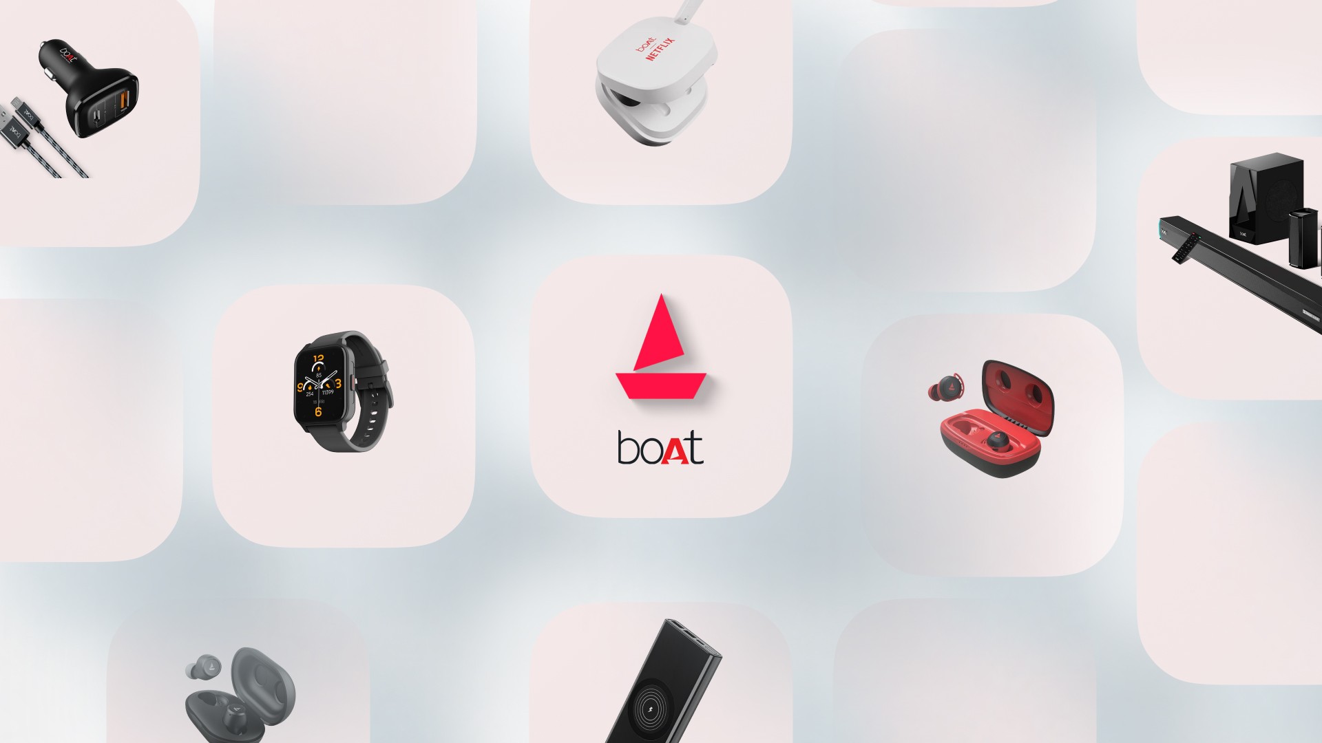
boAt, a prominent consumer electronics brand, offers a diverse range of audio products, smartwatches, and accessories. The previous website, while functional, presented several issues that hampered user engagement and navigation.
As a UI/UX designer, I aimed to revamp the site to enhance user experience, refresh its visual appeal, and improve content hierarchy while preserving the brand's identity.
My Role
I gave the boAt website a serious makeover, like slapping a fresh coat of paint on a house but with pixels! I boosted the font sizes so no one needs a magnifying glass to shop, tidied up the content like a neat freak on a mission, and made sure every section was as visually consistent as matching socks. Now, navigating their site is smoother than their speakers’ bass! Basically, I made it so easy, even grandma could order earbuds without getting lost in cyberspace!
Design Roadmap
Discovery
Current Website Analysis
Competitive Analysis
Identifying Challenges
Define
User Personas
Empathy Map
Ideation
Wireframes
Information Architecture
Design
Color, Typography
Visual Design
Discovery
Competetive Analysis


Outdated Design
The website looked like it was still partying in the early 2000s, desperately in need of a style upgrade.
Cluttered Layout
The products were so crammed together, it felt like a Black Friday sale where no one could move.
Distracting Backgrounds
The backgrounds were so busy, it felt like the products were playing hide-and-seek.
Complex Navigation
Finding key sections was like going on a scavenger hunt—scrolling and clicking just to find the basics.
Small Font & Readability
The font was so tiny, you’d need a magnifying glass and superhuman vision to read it comfortably.
HMW
What specific improvements or features would enhance the user experience?
How can the design simplify navigation and improve product visibility?
This process helped me to integrate ideas into the final design, ensuring it not addressed user frustrations but also aligned with business objectives, particularly around brand identity and product promotion.
Key Solutions Implemented
Clean Product Display: Switched to a plain black background for product images, eliminating visual clutter and making the products the focal point.
Streamlined Navigation: Grouped all product categories under "Best of boAt" for easy access, reducing the need for excessive scrolling.
Readable Font Sizes: Increased font sizes to improve readability and reduce user frustration.
Promotion Highlights: Prioritized top deals which have Clean Product and User review Display and products to grab user attention and boost engagement.
Consistent Layout: Ensured uniformity in section widths and alignment for a more polished user experience.
User persona
Name: Meera Singh
Age: 26
Tech Proficiency: Intermediate
Background: Meera is looking to upgrade her earbuds as she finds her current ones uncomfortable for long-term use. She values aesthetics and brand identity alongside performance and is switching to a new brand for style and function.
Goals:
Look for a brand that offers a blend of comfort, modern design, and practical features like noise cancellation and water proof.
Frustrations:
Many online stores do not showcase clear product specs or comparisons upfront.
Motivations:
Prefers earbuds that come with stylish designs and are backed by strong customer service.
Hobbies:
Listening to music, attending virtual events, and creating online content.
Says:
"The product should look good while being functional."
Thinks:
"I don’t mind spending more for comfort and durability."
Does:
Frequently consults social media and influencers' opinions before deciding on the purchase.
Feels:
Disappointed when aesthetics overshadow practicality in a product.
Wireframes
Figma time !!
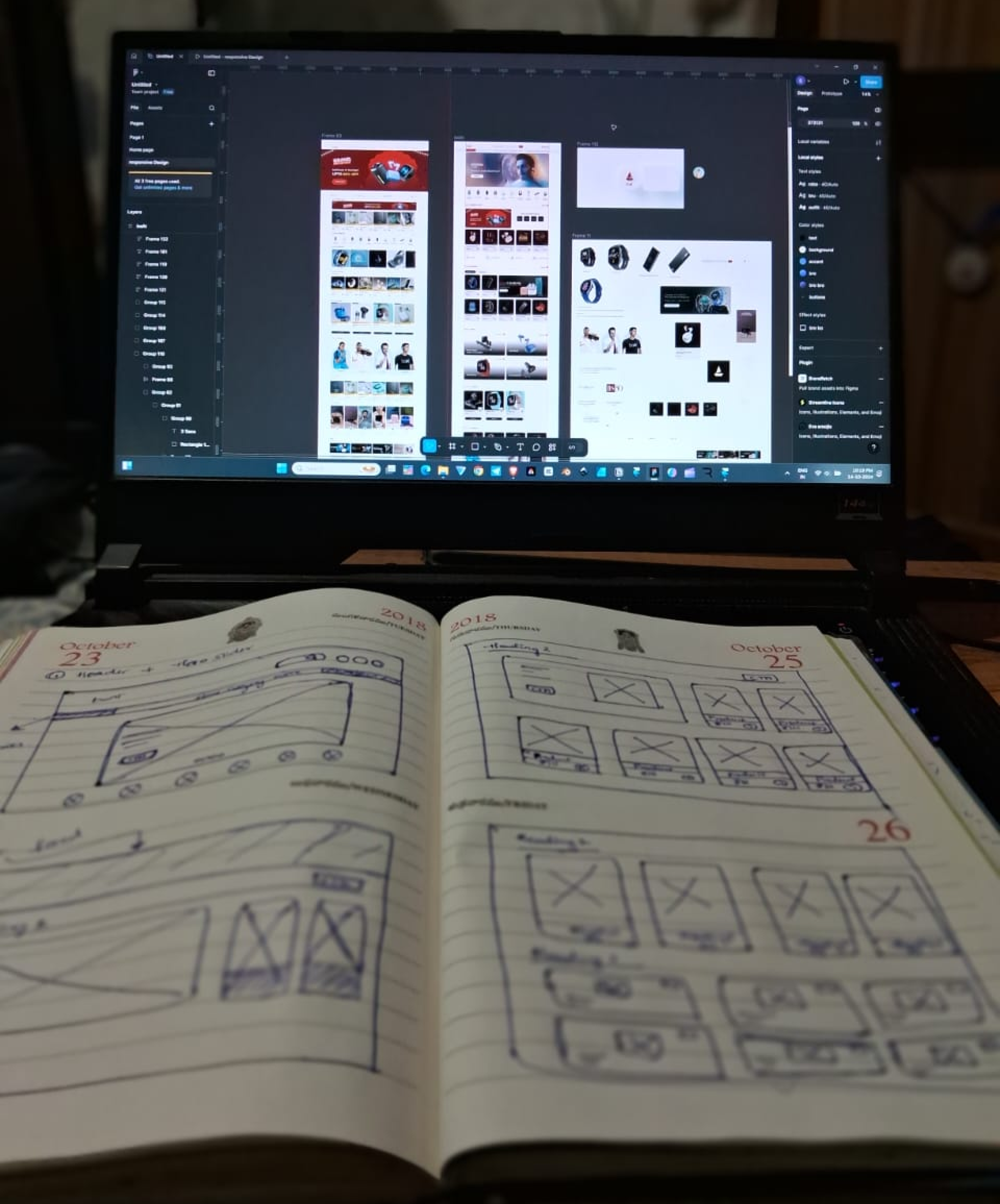
Magic Begins
Before

After
Category dropdown
Simplified header
Visible search bar
Prominent cart, wishlist and profile icons
Hero slider in visible scale
Modern color tones

Before

After
Added countdown timer
Enhanced product display
Improved visual hierarchy
Better font sizes and readability

Before
After
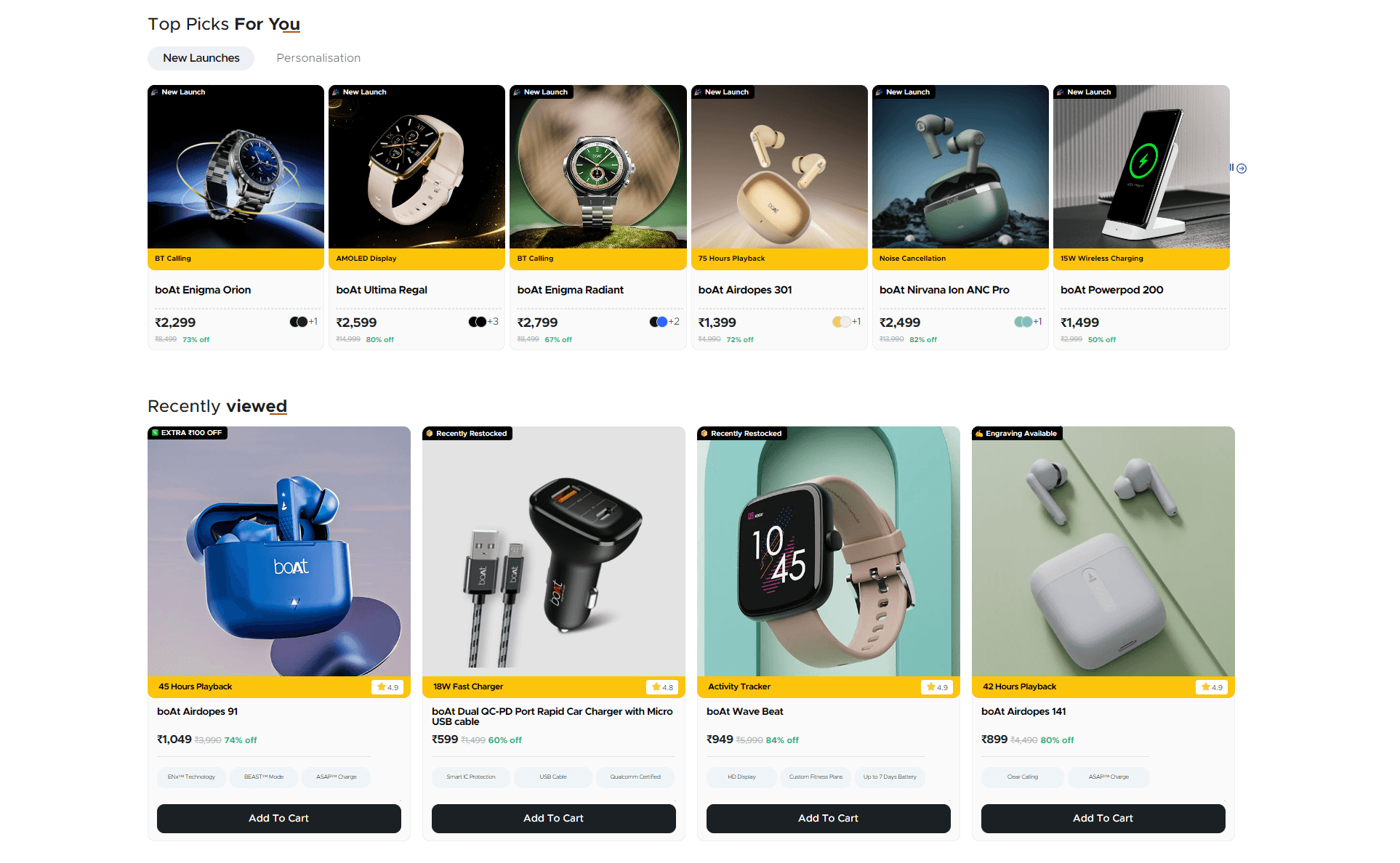
Combined "Top Picks for You" and "Best Sellers" into "New Launches" for better navigation and less clutter.
Uniform black background for products enhances focus and modernity, replacing the distracting backgrounds of the old design.


Before
Old Design: Categories like "Home Theatre Systems & Soundbars" and "Top Earbuds" required individual navigation, making it difficult for users to quickly access their desired sections.

After
New Design: Product categories are now directly visible on the page with "Shop Now" buttons, reducing clicks and enhancing user accessibility and navigation.
In Lifestyle ,The gradient enhances category visibility, making it more appealing than the plain background. This clarity helps users quickly find their desired category, improving engagement and speeding up purchase decisions.


Before
After
The new hierarchy highlights products alongside video reviews and allows user-initiated playback, enhancing the experience by minimizing distractions.
This keeps viewers focused on both the product and the review, increasing trust and engagement, and improving click-through rates.

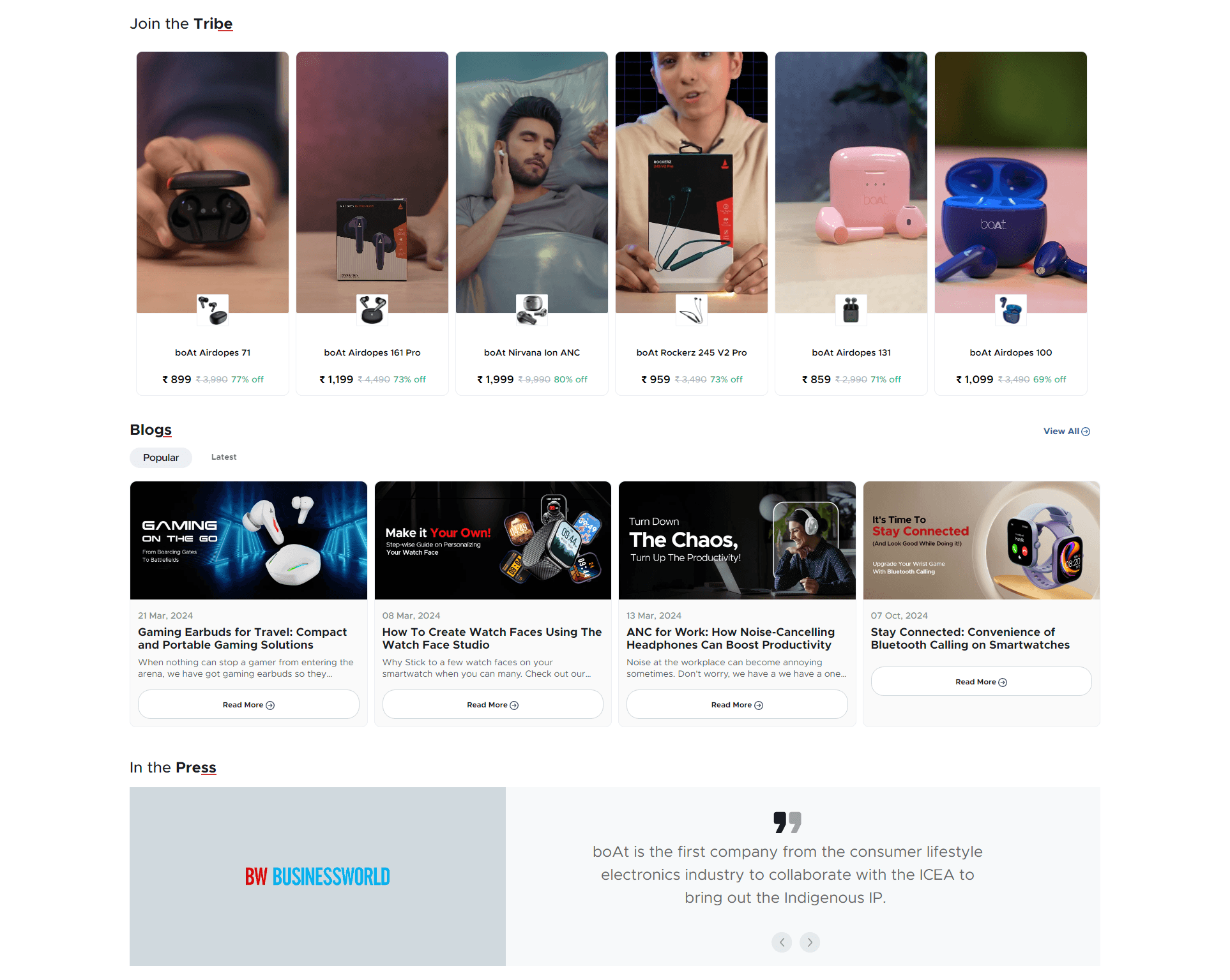
The redesigned boAt blog section simplifies user experience by displaying only essential information on each card, making it easier to scan.

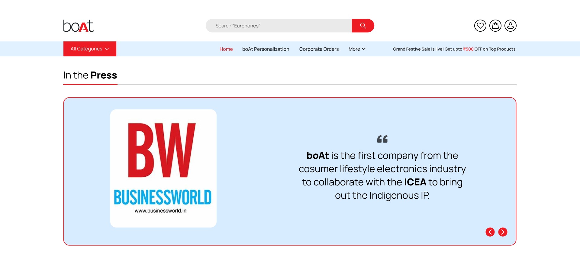
The "In the Press" section improves organization and visual appeal with larger thumbnails and better spacing, enhancing readability and user engagement.
Style guide
Themed buttons
Click me
Hover
Pressed
Disabled
Click me
Hover
Pressed
Disabled
Text only buttons
Pressed
Disabled
Click me
Hovered
Icon buttons
Normal
Hover
Pressed
Typeface
Manrope
A B C D E F G H I J K L M N O P Q R S T U V W X Y Z
a b c d e f g h i j k l m n o p q r s t u v w x y z
